HydraGlow Co.

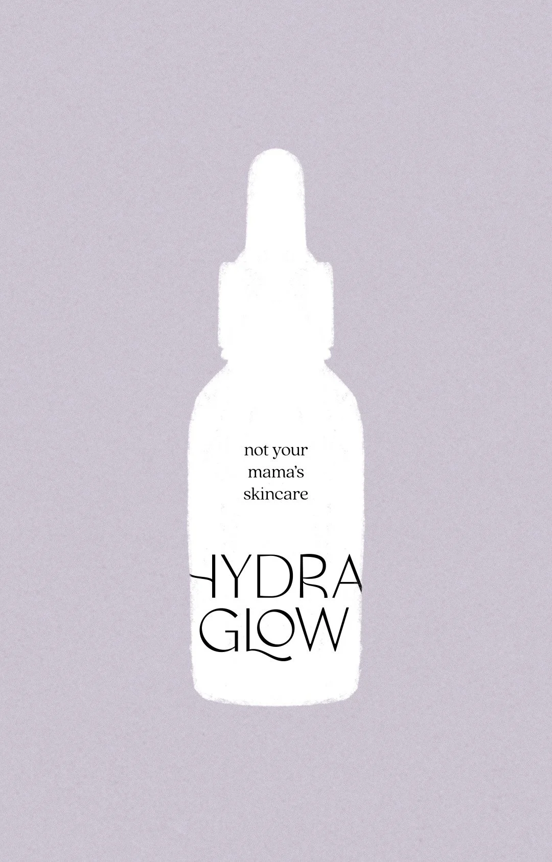
HydraGlow Co. is your sidekick to skincare products, for example, ice globes to minimize puffiness. The target audience for this brand was a younger crowd, so I tried to loosen up and have fun with those letterforms while keeping it elevated. Below is my favorite concept, which was not chosen to move forward.

While this project was never completed, it was a great challenge for me to break out of my comfort zone and try something different.

PROJECT SCOPE

Logo Design

CLIENT: TISHA & AVA ODOWD
YEAR: 2024
LOCATION: FRANKLIN, TN
Light purple background with the word 'HYDRAGLOW' in white, stylized text.
Light blue star-shaped graphic with multiple pointed tips on a black background.
PROJECT GOALS

To design a logo that 1) is both fun and relatable to a young, female audience, 2) is aesthetically pleasing, and 3) can grab attention in a storefront. Below you can see the mood board that inspired the visual direction of this project!

Collage of various images: shiny pastel-colored cards, a book titled 'Salt,' skincare products with glass dropper bottles, a woman in a white hoodie by the ocean, a woman with clear ice on her face, a woman in a kitchen with flowers, and business cards for Julia Wilson.
A light blue starburst shape with multiple points on a black background.
my favorite concept:
Neon sign reading 'HYDRA GLOW' in light blue and white on a light grey background.
A skincare product bottle labeled 'Hydra Glow' with the phrase 'not your mama's skincare' on a light blue background.
Text that reads "HYDRAGLOW" in purple and light blue neon-style fonts on a grey background.
A skincare product bottle with the text "not your mama's skincare HYDRA GLOW" on it, set against a plain background.